In 2020, I took an 8-week visual design course through General Assemb.ly. Not only did I want to learn how to create a responsive webpage but I wanted to strengthen my foundational knowledge of design principles and theories in order to better be able to effectively solve design problems.
For my project, I developed a responsive website for a fictitious juice company named quench. Below is an overview of my journey through this course and the steps I took to get to the final product. For those who like to cut to the chase, I started with the final design and then delved into my process.
Research
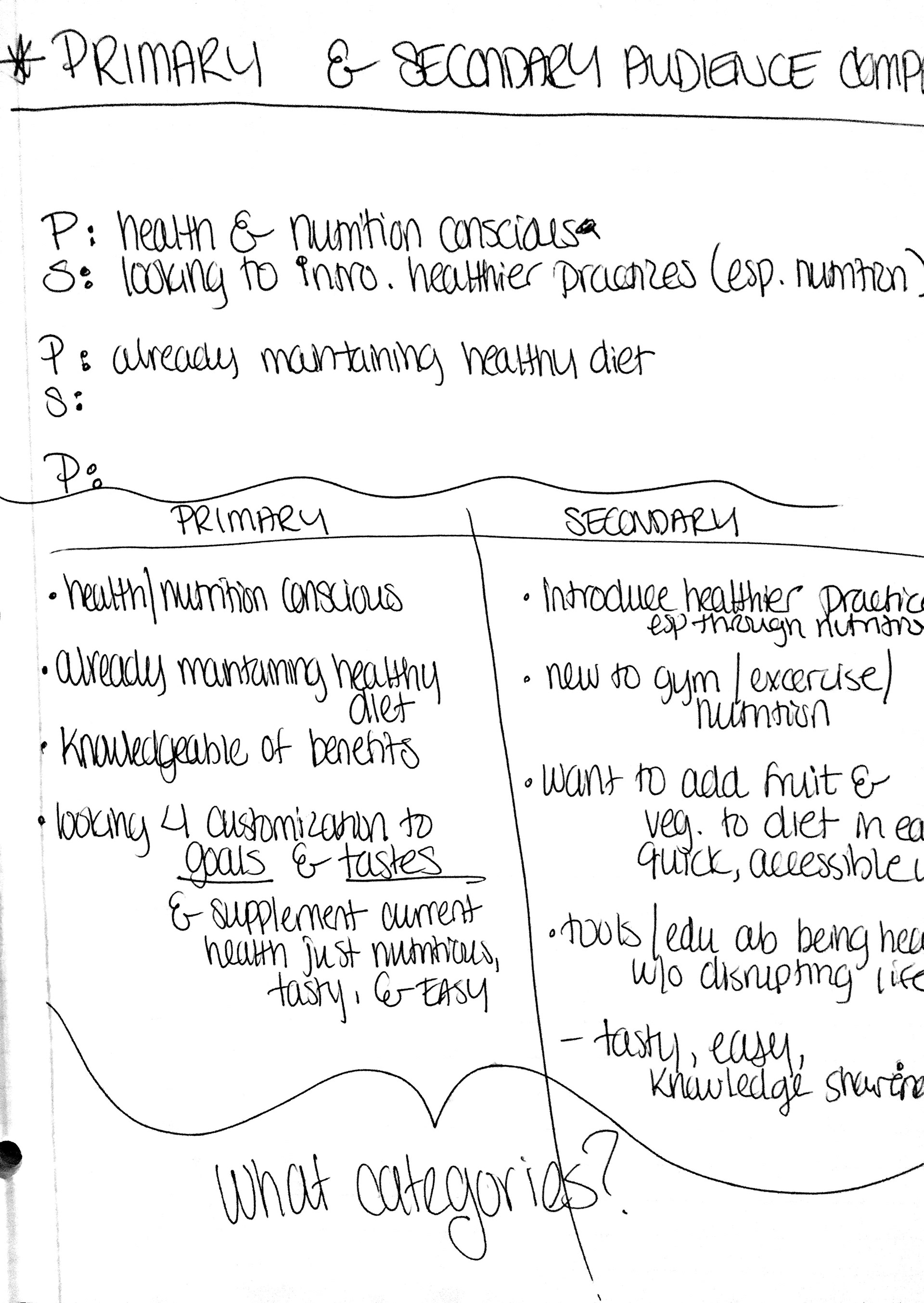
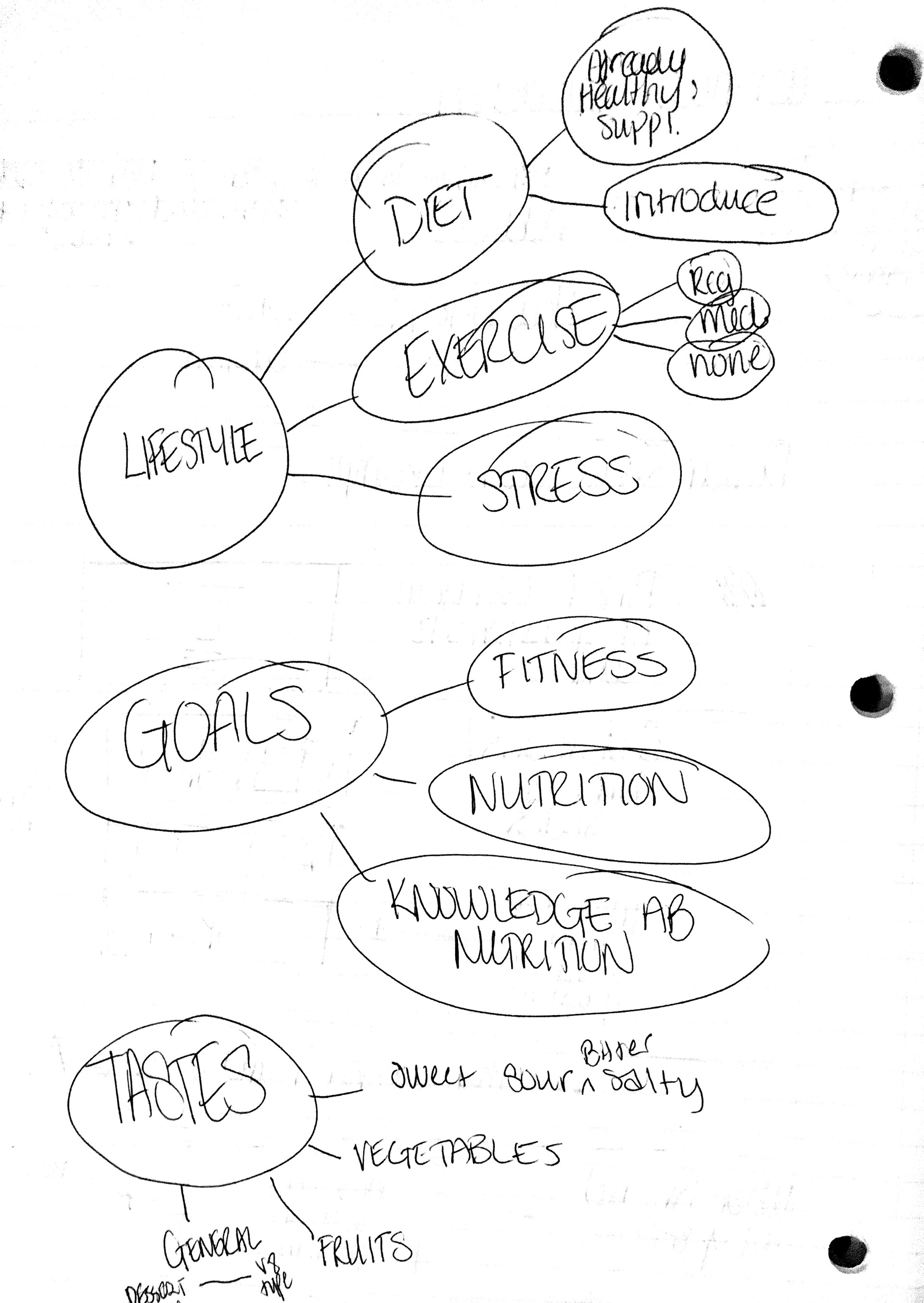
Visual Competitive and Audience Surveys
I started with studying the company's creative brief and extracted keywords to use as building blocks for the design direction and help me develop a project objective and strategy.
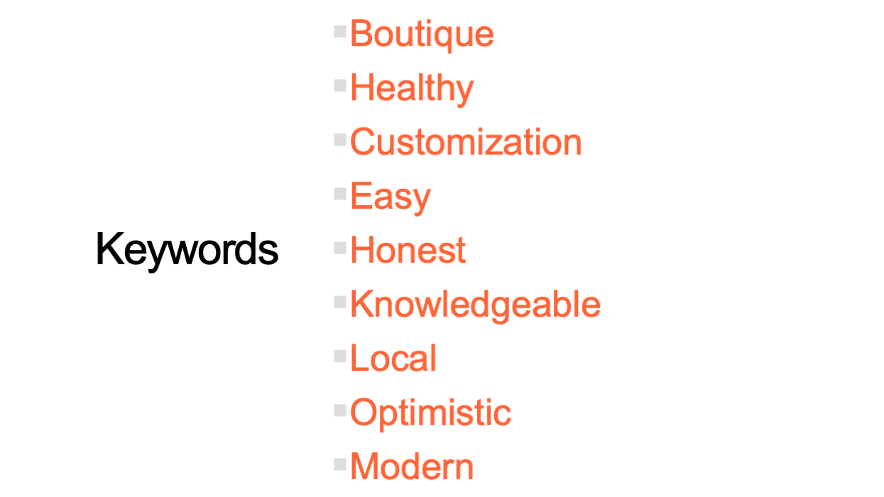
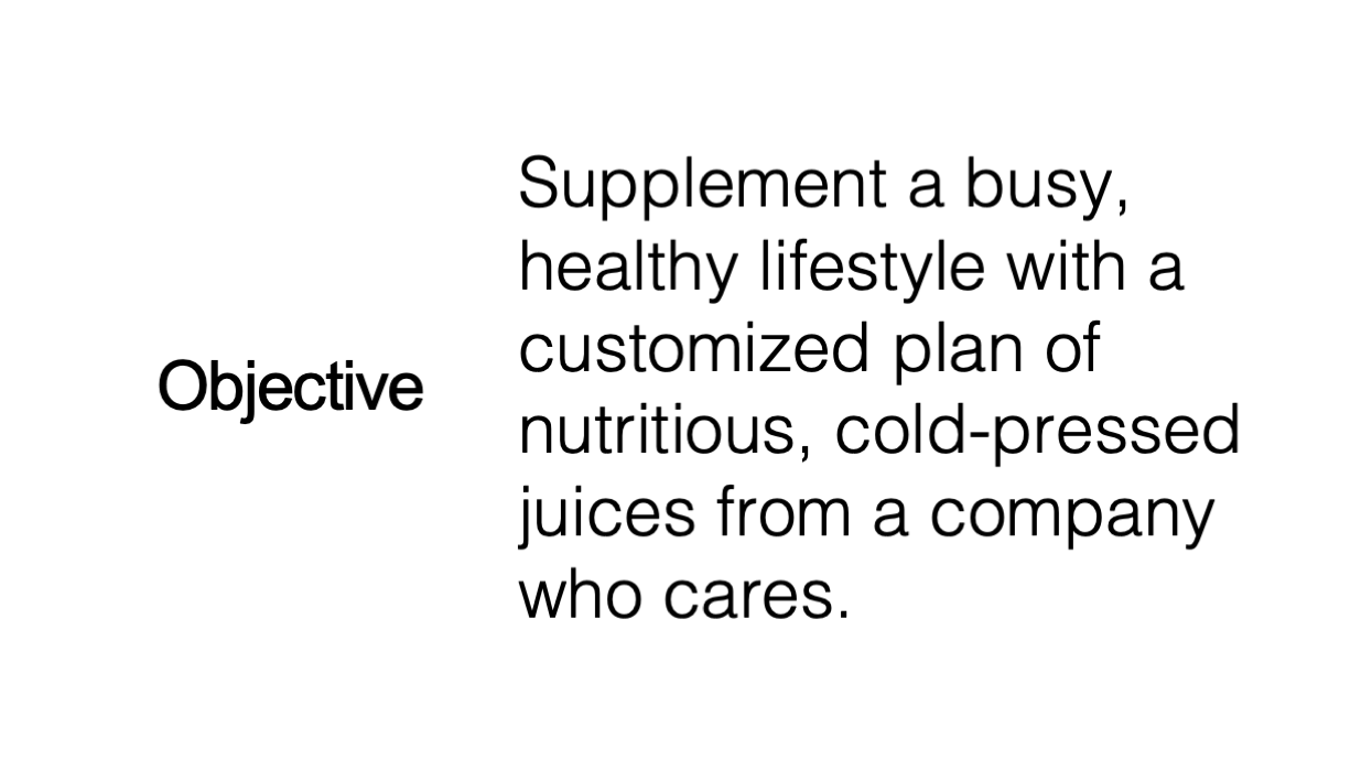
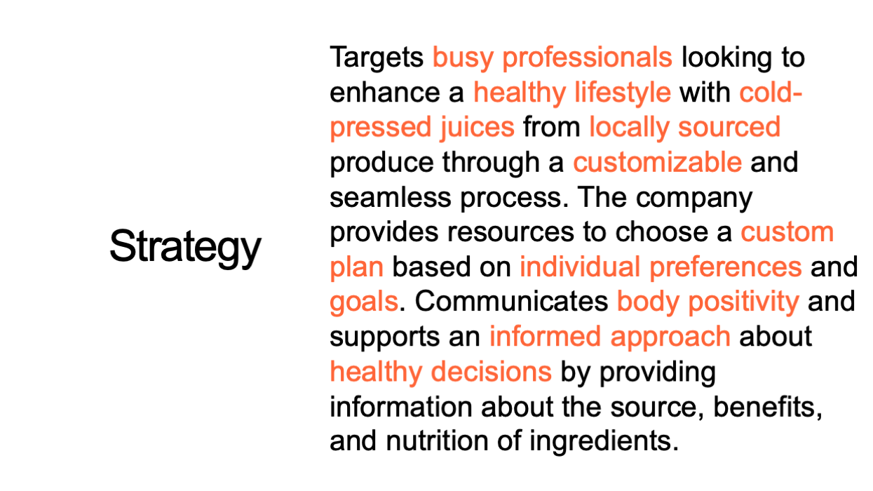
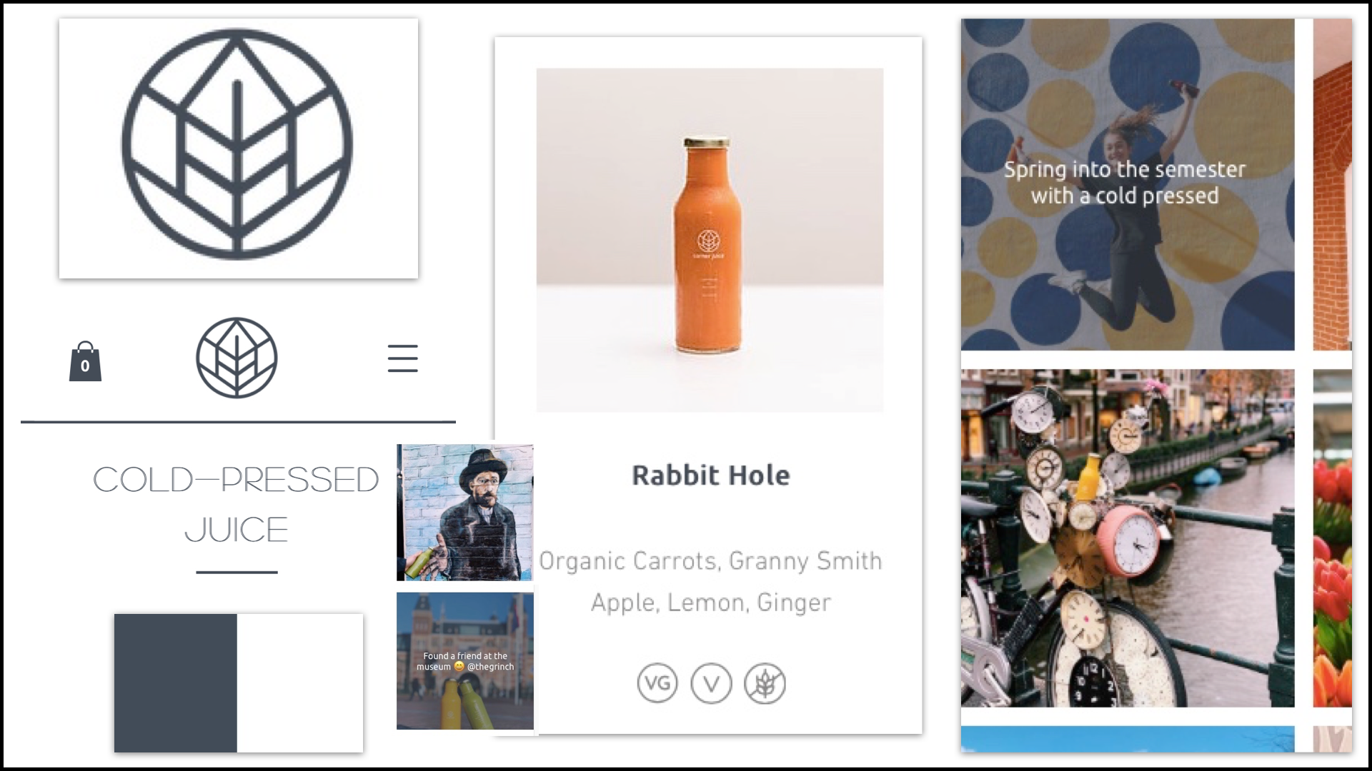
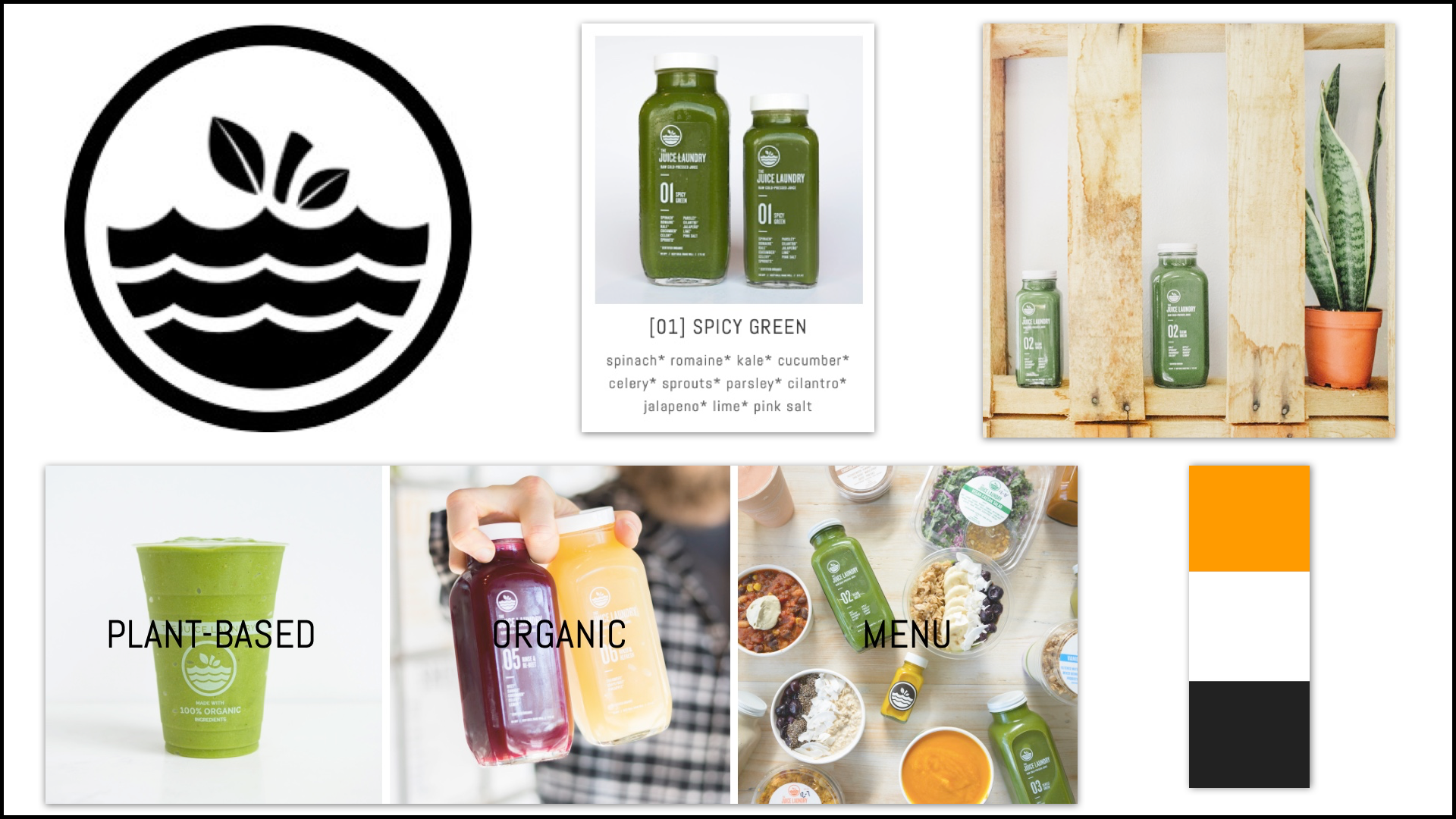
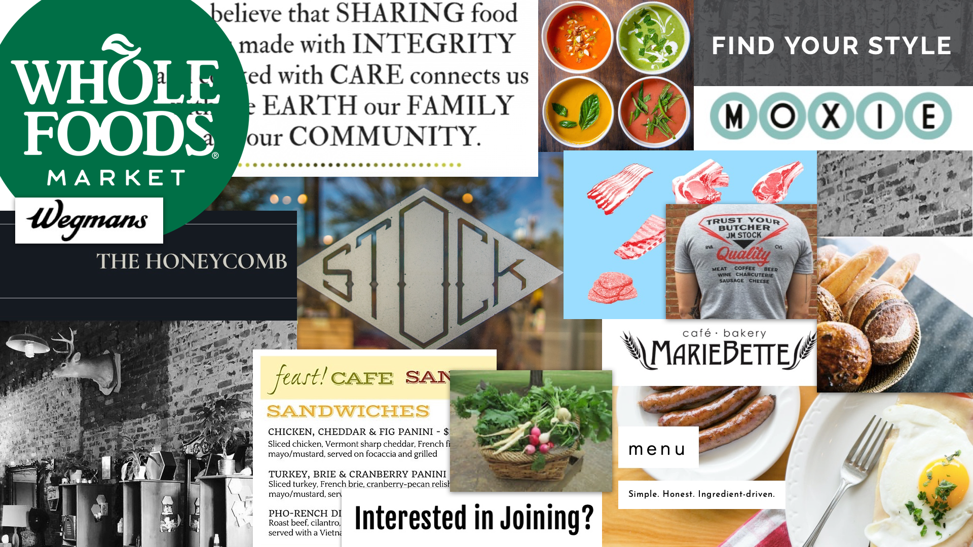
By researching competing juice companies and other businesses that appeal to the target audience, I was able to gain a sense of what type of design appeals to the audience, pick up on any trends/patterns in the design layout and UX, the general feel, etc.

Mood Boards
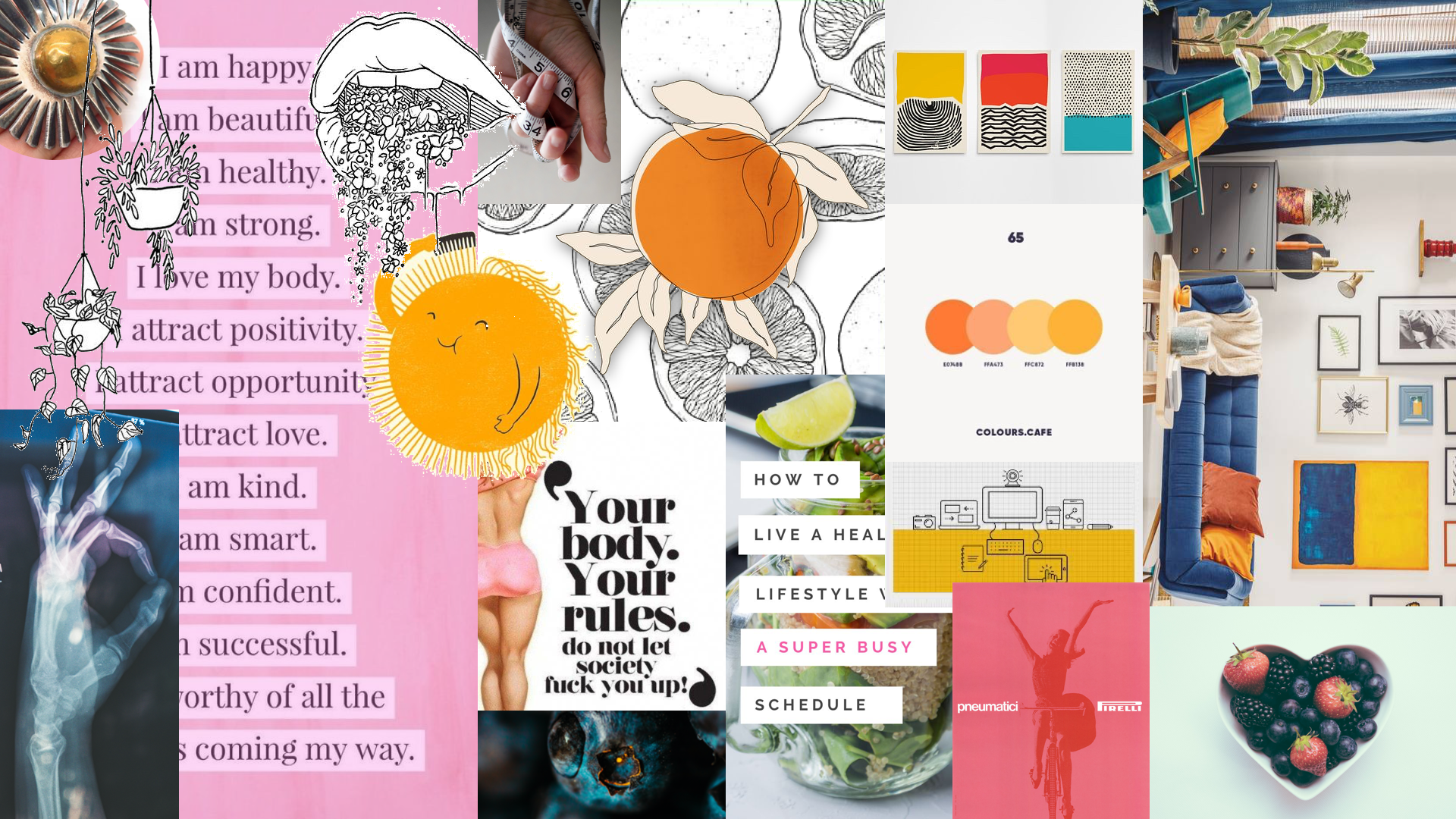
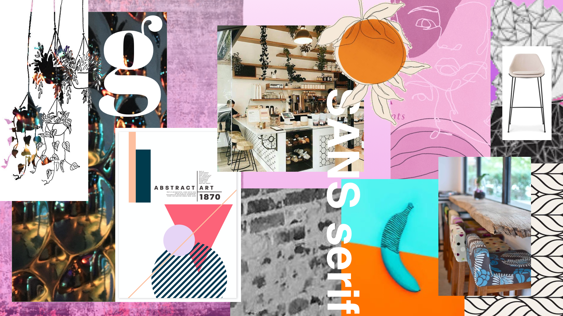
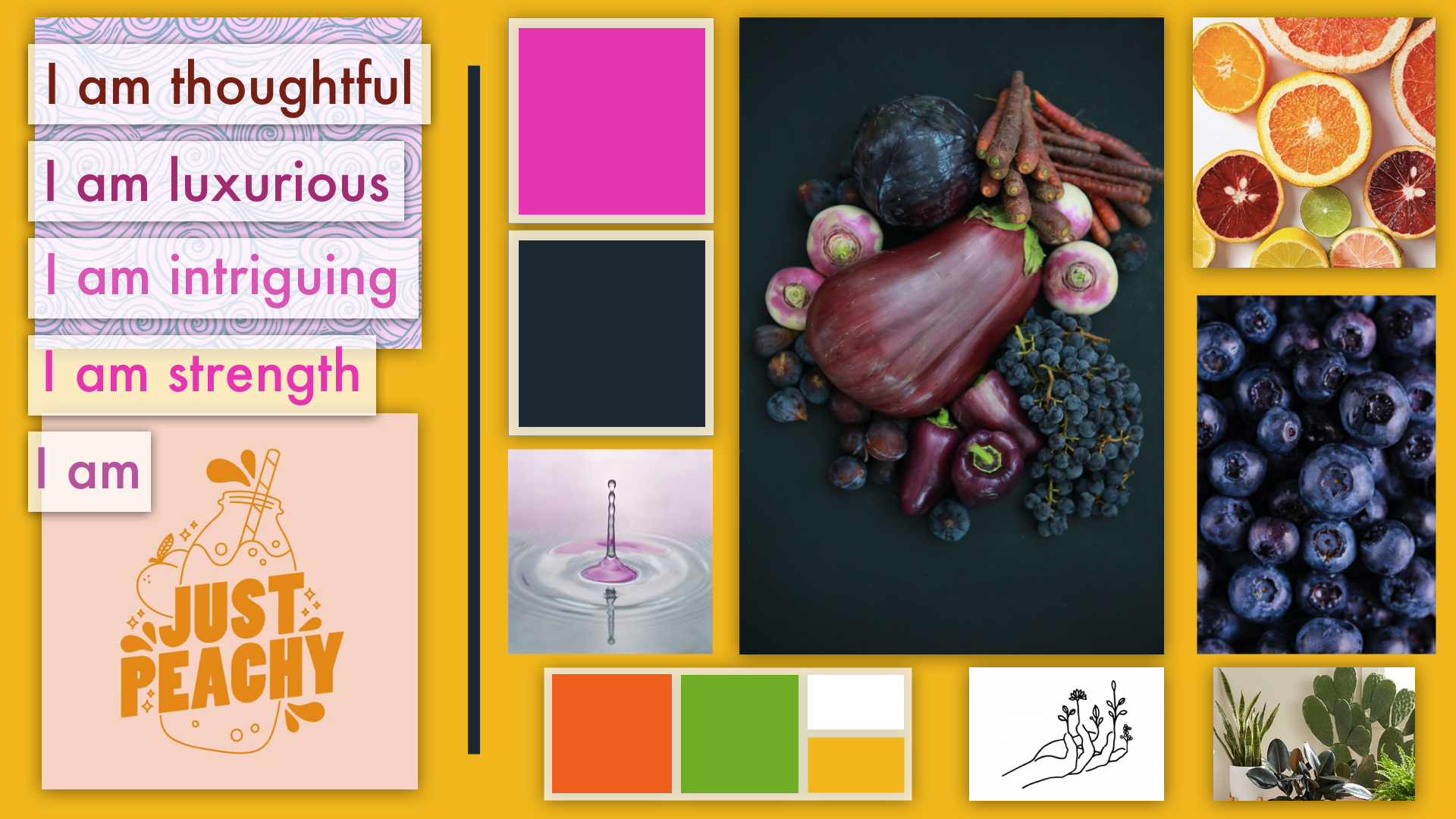
After researching company competitors and the target audience, I developed mood boards based on the brief to express different design directions to help inspire the client and form starting ideas to springboard from. For the mood boards below, I focused on two keywords from the brief - "boutique" and "optimistic", juicy-related colors, and a modernist design style. I never knew how fun it was creating mood boards!

Lo-Fi Compositions
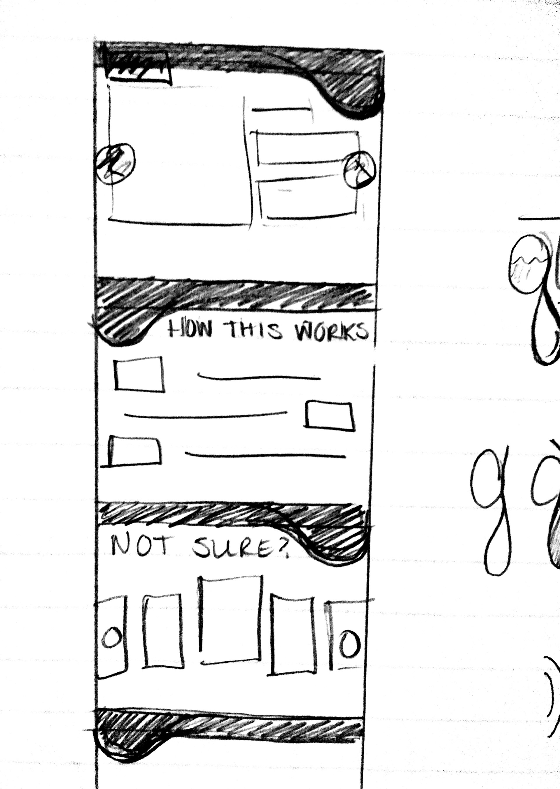
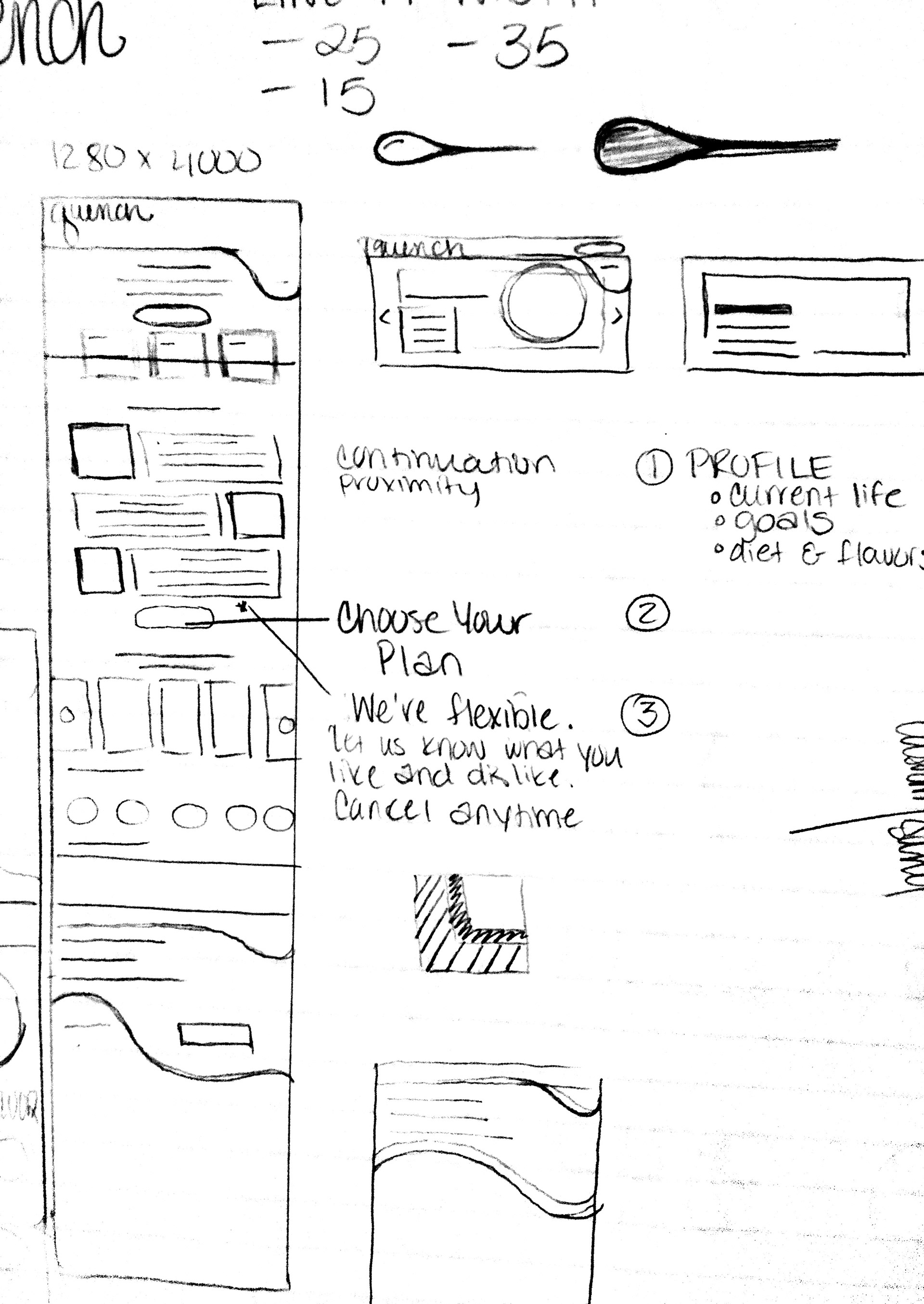
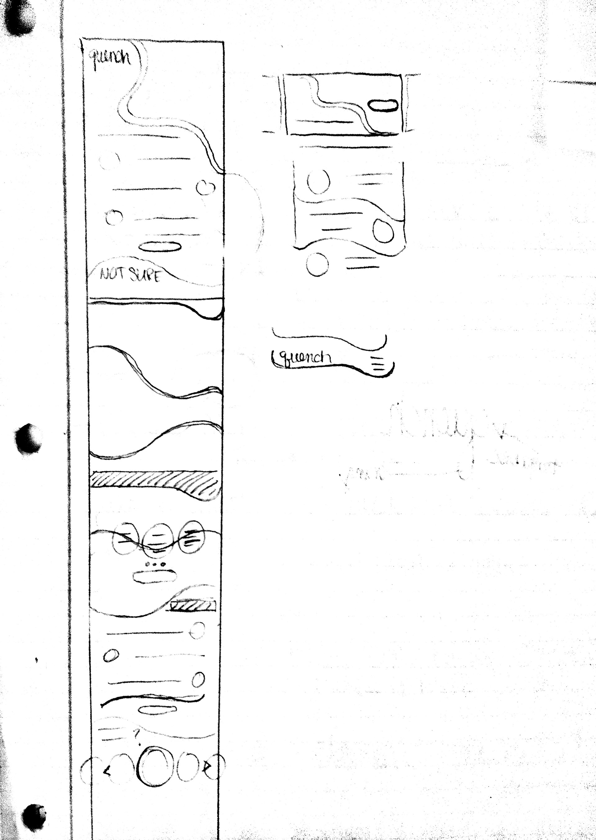
Next up, I developed lo-fi compositions of the website homepage. While keeping in mind my previous research, I focused on the using contrast and gestalt principles to create hierarchy, draw attention to focal points, and guide the user through the page.
Color
I applied a lot of research when developing color schemes for the design. I wanted to make sure that the colors were not only unique and aesthetically pleasing but meaningful to the brand. I also had to be mindful of ADA standards such as designing for colorblindness.
For my research, I studied the meaning of colors and then paired keywords from the brief with the color it most symbolized. I focused more towards colors that were on opposite sides of the color wheel in order to portray contrast and a unique vibe. From the two color schemes I narrowed it down to, it was a fight between blue and purple. Blue won due to its meaning of honesty and reliability which was important to the overall brand.
Typeface
Being an obsessed typeface fanatic, I thought this process was going to take me down a font-filled rabbit hole of indecision, however, I already had a vision from earlier in the process so I didn't get too carried away. I wanted to pair a clean, classy serif with a simple sans serif. Originally, the sans serif was the header and the serif was the body copy which took away the sophisticated feel I was going for but after switching them, it ended up working out. The two fonts I chose for the final design were Mencken Std Head and Montserrat.
Interaction
Logo
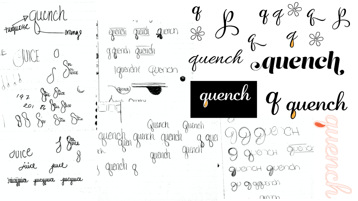
Since this was a fictitious company, I had the opportunity to come up with a name and design a logo for the business. I started my sketches and idea mapping for the logo from the beginning of the project which I feel helped it evolve nicely as the final website design was developed. I kept the logo simple. My intention was to convey reliability via the blue color and a classy but casual feel with the easygoing, script typeface. I added a touch of fun by incorporating the orange droplet to represent juice. I went with the word "quench" to represent the idea of relieving thirst, hydrating and satisfying the nutritional needs of the body.

Desktop
Mobile